

Before you order a logo: what your brand really needs from a visual identity
The logo is the part everyone sees, but it is not the whole identity. Here is what makes a brand recognisable at a glance and consistent wherever it appears.
By Kaizen editorial team3 min read
Many projects start with one request: “we need a logo”. Months later they find the logo alone is not enough: every designer uses it differently, colours change from one print to the next, and the social accounts look nothing like the website. A visual identity is what prevents that drift.
The logo: simple enough to remember
A good logo reads small on an app icon and large on a building. Drawing it on considered proportions such as the golden ratio gives it a balance the eye feels without knowing why. It also helps to see more than one concept; comparing them shows what truly fits your brand.
The guidelines: so no one improvises
Logo guidelines set the clear space around it, its minimum sizes, and what must never be done to it: no stretching, no random colours, no improvised shadows. They are the document that protects your investment in the identity.
Type and colour: the brand’s visible voice
Choosing typefaces and a colour system is not personal taste; it decides how every message you send looks. One or two typefaces with clear weights, and primary and secondary colours with exact values for print and screen, are enough to make every piece look like family.
Visual style: beyond the logo
The photos you choose, the graphics, the patterns and how posts are laid out all form the visual style. When it is consistent across print, the website and social media, people recognise your brand before they read its name.
Applications: where the identity really lives
Stationery, business cards, signs, facades, brochures, the app icon: this is where the design is tested. An identity that looks good in the presentation file and then stumbles on an outdoor sign needs another look.
From our work
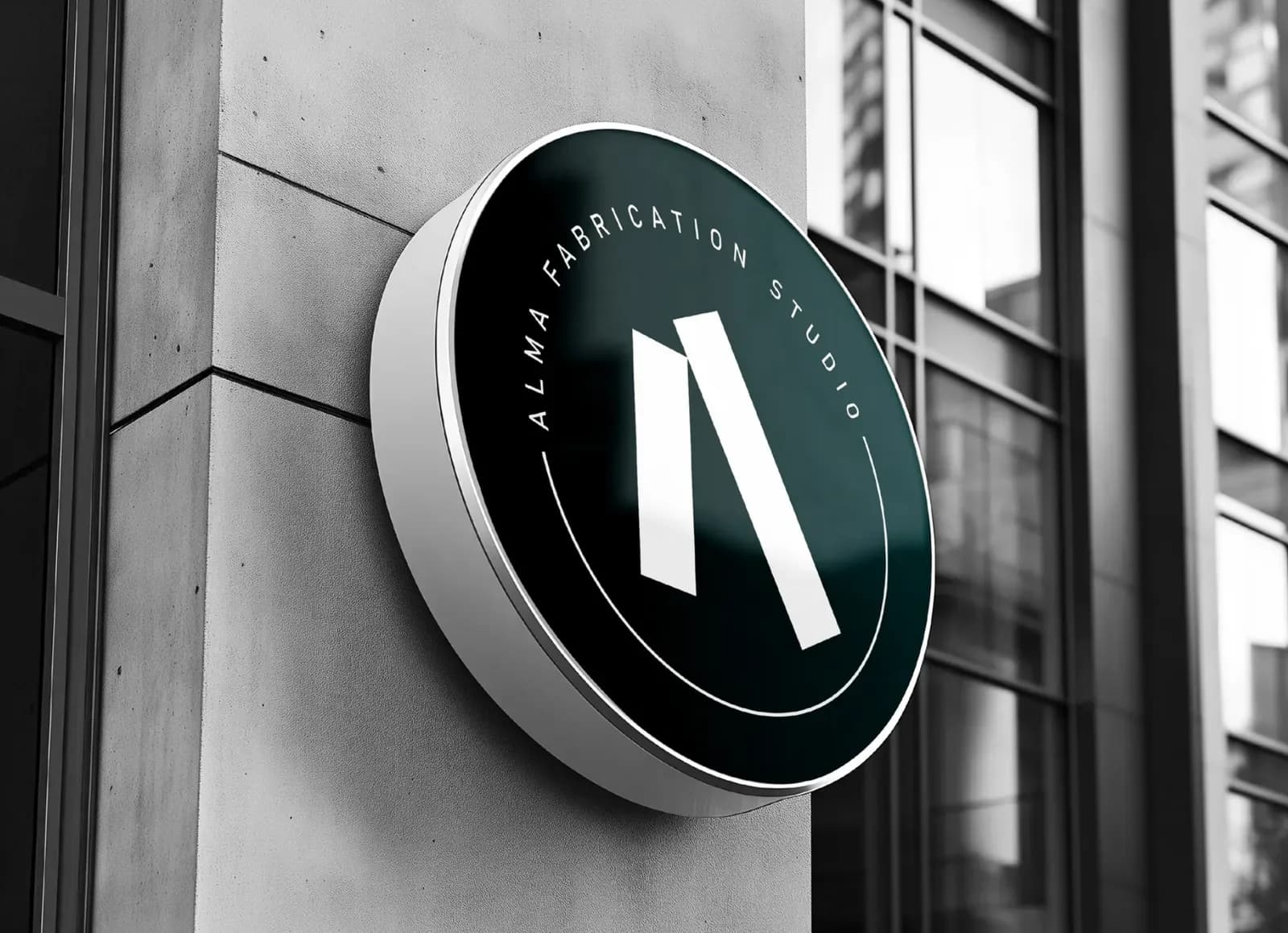
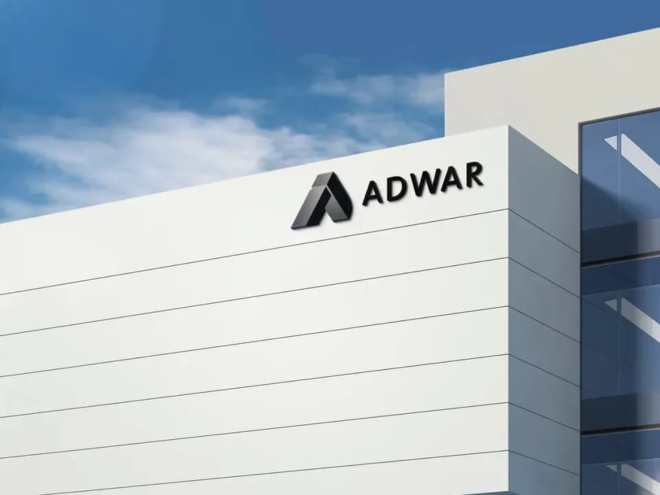
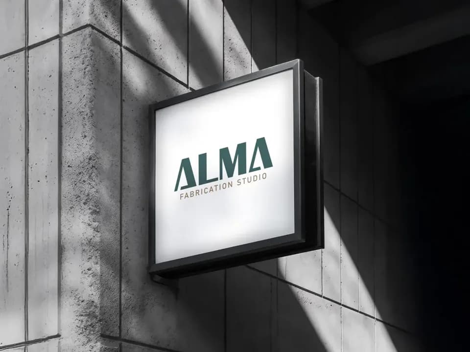
For Adwar United Holding we presented three logo proposals, each with its own philosophy, then applied the chosen one to stationery, business cards and the building facade. For Qafza we developed the visual identity and carried it from the logo to stationery, brochures, billboards and the app icon. And ALMA Fabrication Studio took its identity onto its website and social accounts, so it speaks with one voice everywhere.
Ask yourself before you start
- Who is your audience, and what should they feel when they see your brand?
- Where will the identity appear most: signs, screens, packaging?
- What sets you apart from your competitors?
- Do you have an identity to develop, or are you starting from scratch?
Frequently asked questions
How many logo concepts do I get?
Two in the Basic package, three in Professional and five in Advanced.
What is the difference between a logo and a visual identity?
A logo is a single mark; an identity is a whole system: the logo and its guidelines, typography, colours and visual style, applied to everything that carries your name.
Can you develop an existing identity instead of starting over?
Yes, as with Qafza, which was a development of its visual identity and its applications.

Read also
Advertising and print2 min read
The promotional gift that stays on the desk: choosing print and gifts that carry your brand well
Some gifts end up in a drawer on day one; others sit in front of the client every day. The difference is the idea and the execution, not the price.
Exhibitions and conferences3 min read
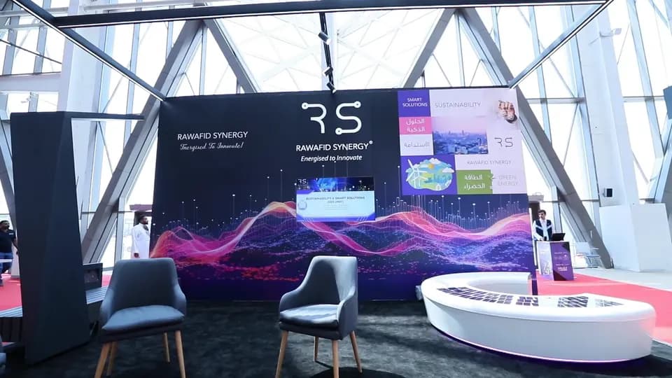
Booth design: seven decisions that separate a stand people visit from one they walk past
A visitor has a few seconds to decide whether to step into your stand or keep walking. These seven decisions settle those seconds, from the first idea to installation night.
Media production3 min read
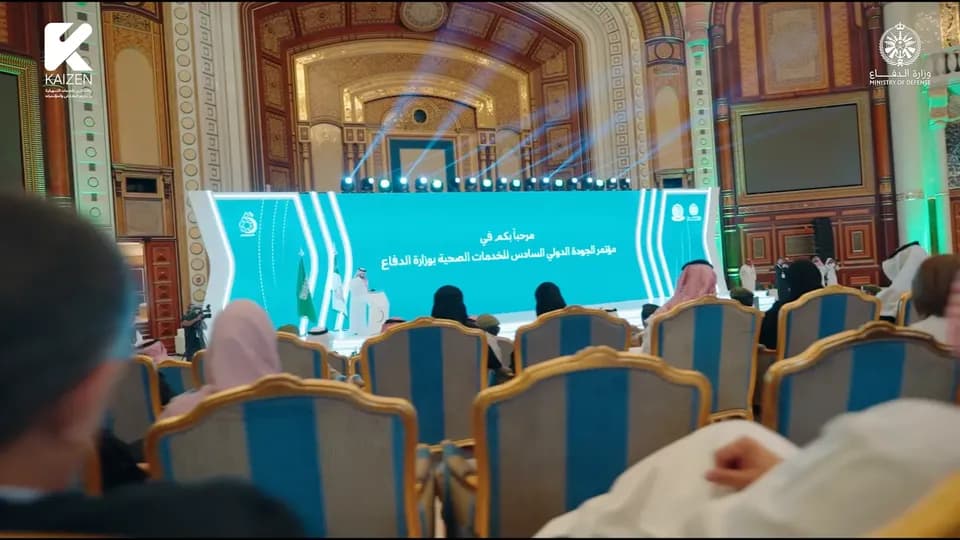
One day, months of content: how to plan your event coverage before it starts
The event ends in the evening, but its photos and films can keep working for you for months. The secret is planning the coverage before day one, not after.